Bebelac: New Generation



Some products need convincing. This one needed celebrating.
Bebelac's ready-to-drink formula milk is, in its own category, a genuine leap forward. It takes the convenience parents already trust from UHT packaging and merges it with the nutritional weight of formula milk, solving a problem most parents didn't even realize could be solved this simply. The internal comparison kept coming up during briefing: this is the iPhone of kids' formula milk. Once you frame a product that way, the visuals can't afford to be modest.
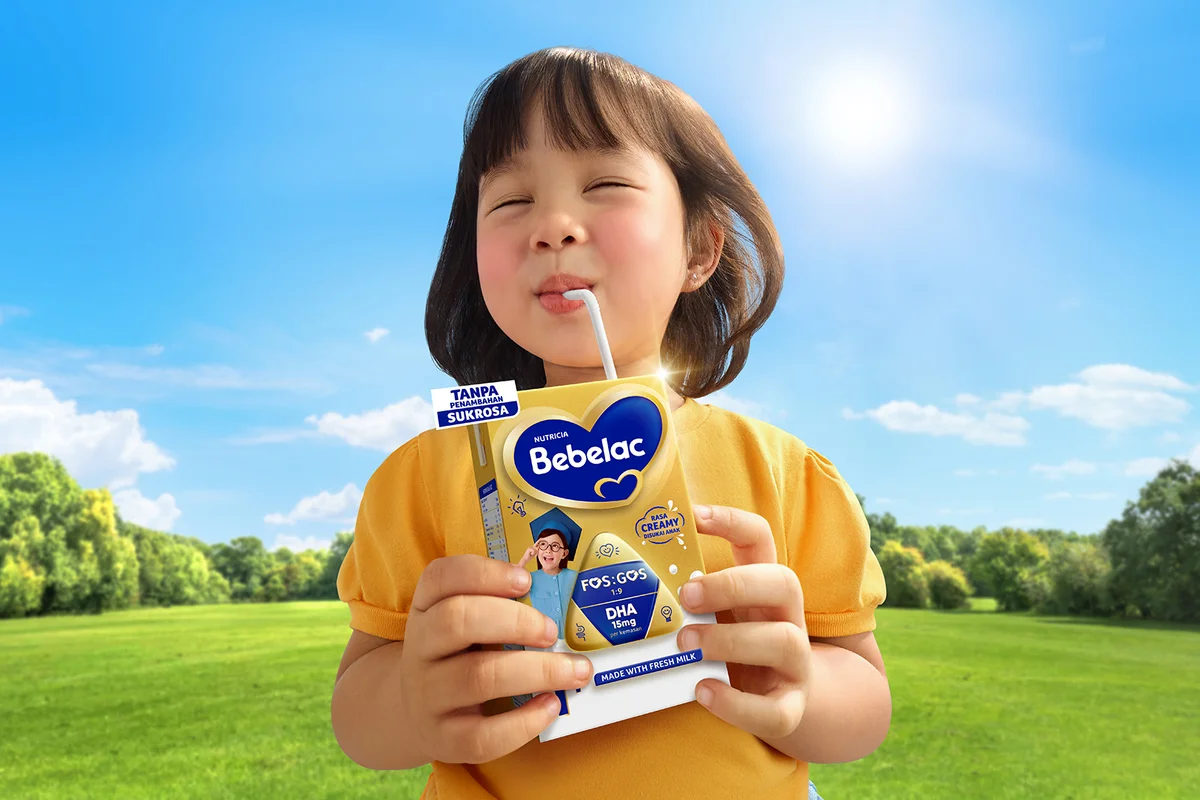
The brief called for something monumental, and monumental meant two things had to work in tandem. First, unmistakable joy, the kind of genuine, unfiltered delight only children have when something tastes exactly right. Second, absolute clarity on the new packaging itself, since recognition on a crowded store shelf is often the difference between a sale and a scroll past. Balancing raw emotion with product legibility is trickier than it sounds. Push too hard into candid energy and the packaging gets lost in motion blur. Push too hard into product clarity and the joy reads as staged.
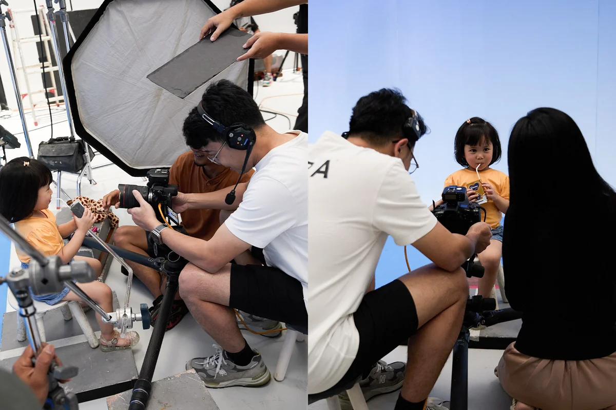
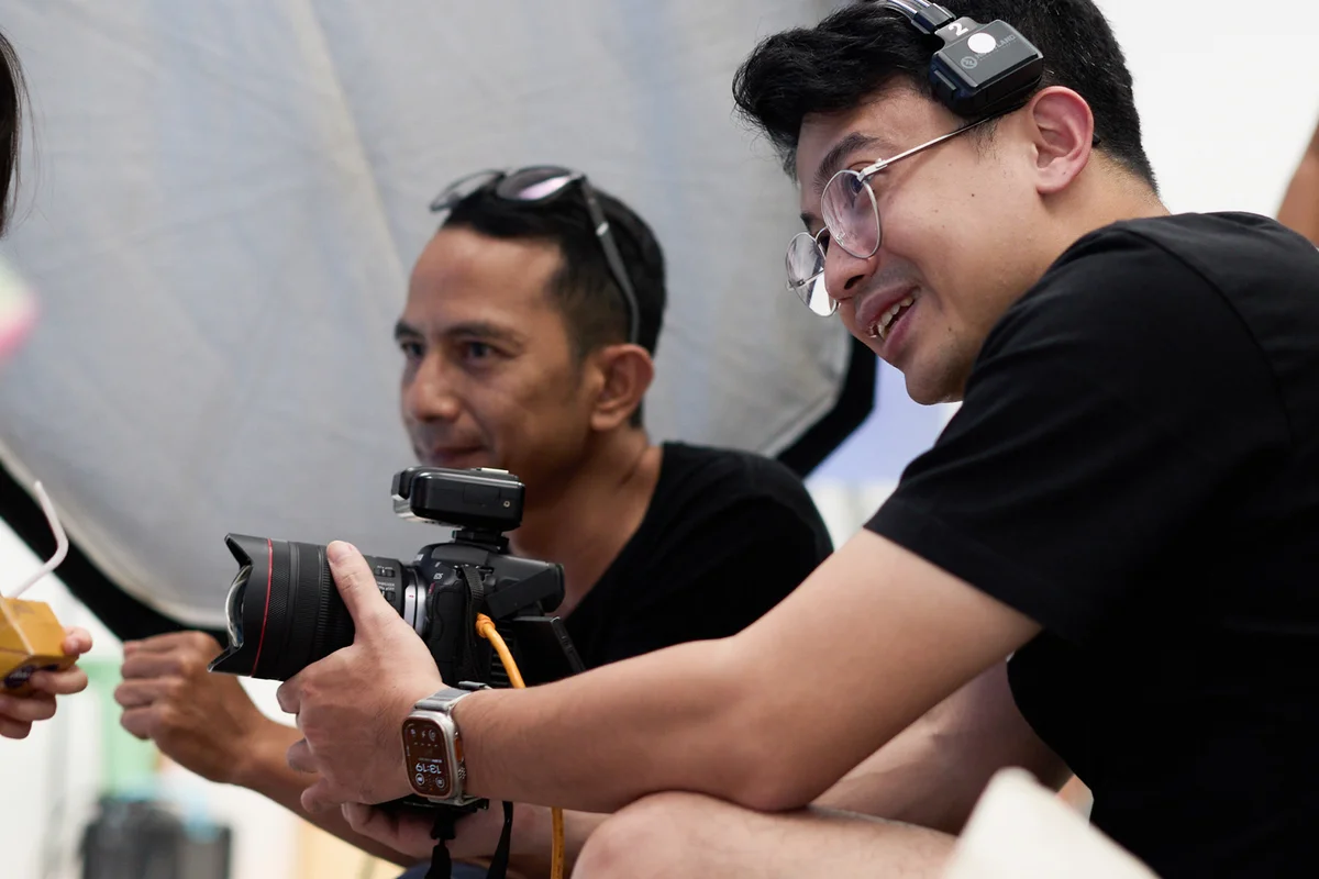
We built three key visuals to carry that balance: a boy version, a girl version, and a product-centric hero shot. For the children, I chased something close to real-life exuberance, the exact moment a straw hits the lips and satisfaction takes over the whole face. Eyes closed, unselfconscious, a little theatrical in the best way. That authenticity took real direction to reach naturally rather than performed, since kids can sense when an adult wants a specific expression and often overcorrect into something forced.
Lighting had to hold two competing truths at once. Warm enough to feel like an actual summer afternoon, blue sky overhead, sunlight with real weight to it, yet controlled enough that the packaging's gold tones stayed true and legible rather than washing out under too much warmth. A slight highlight accent in the upper corner of the product gave it that faint premium glow, a visual whisper that this was something new worth noticing, without ever compromising how clearly someone could read the label.
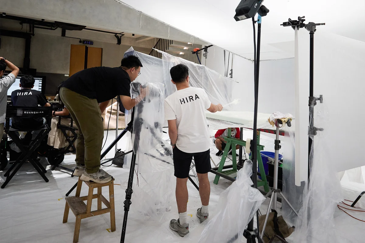
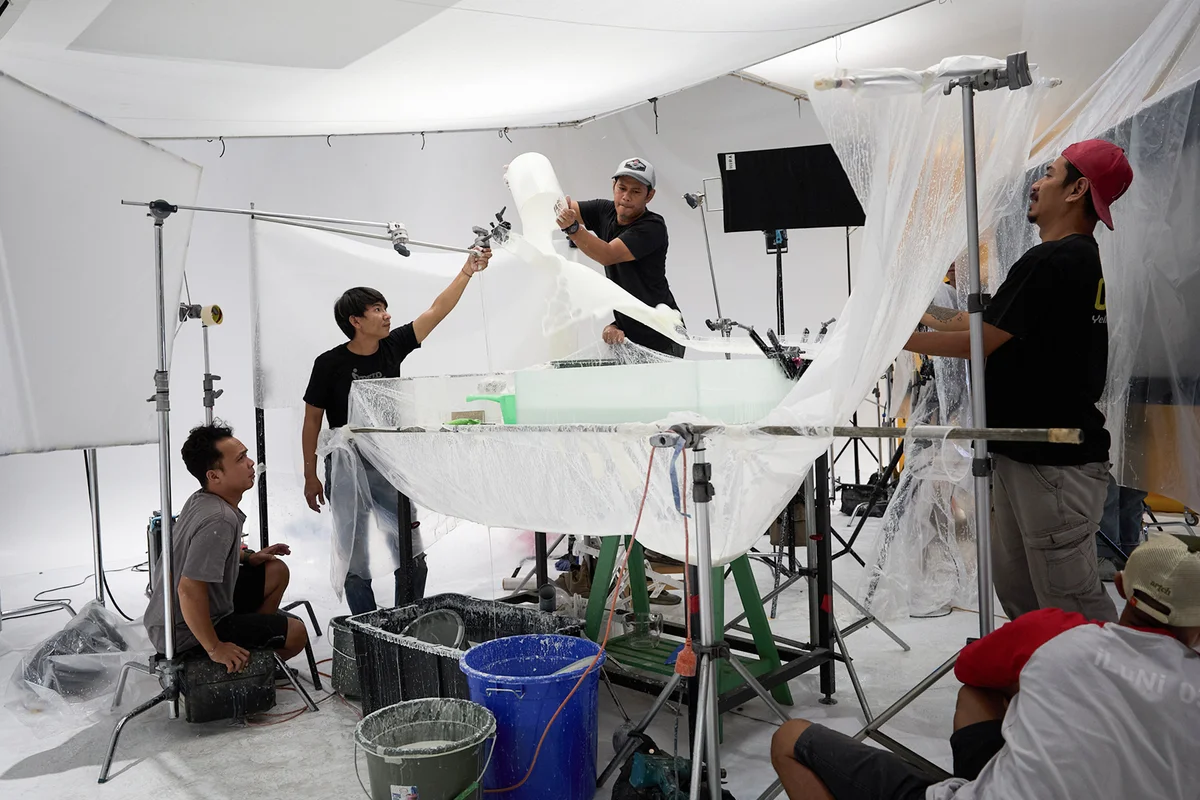
The liquid itself became its own character. Every splash needed to feel purposeful rather than chaotic, shaped and directed to complement the product rather than obscure it, built through repeated attempts and stock elements combined carefully in post. And because shelf presence was the whole point, we scaled the packaging itself beyond its actual size in certain visuals, exaggerating it just enough that recognition would be instant and impossible to miss.
What stayed with me from this project was how much craft goes into making something look effortless. A child's laughter, a perfectly timed splash, a box that seems to glow from within, none of it happens by accident. It's built, frame by frame, until joy looks as simple as it is supposed to feel.
Adhitya Himawan
Co-founder and photographer of HIRA Imaji, Jakarta.