IQOO 13
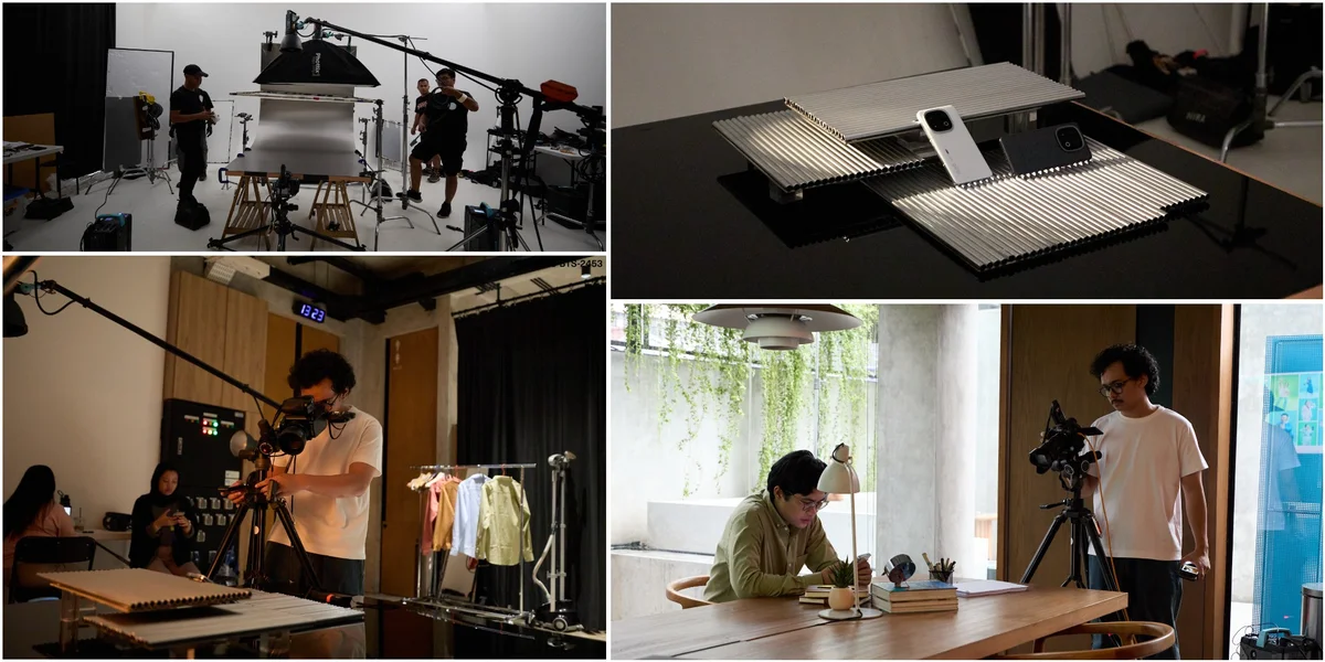
A phone launch usually leans on one hero shot and calls it a campaign. IQOO 13 asked for something bigger: a full set of key visuals, each built around a different facet of the device, but all needing to feel like they came from the same world.
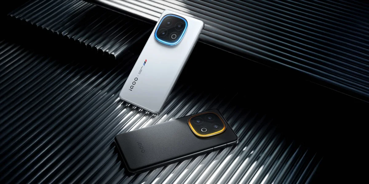
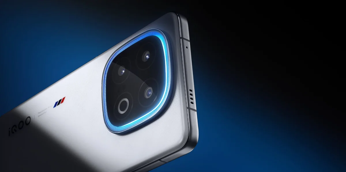
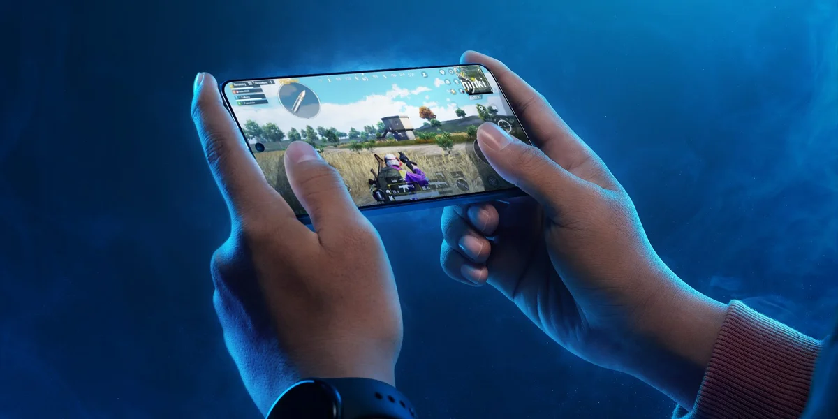
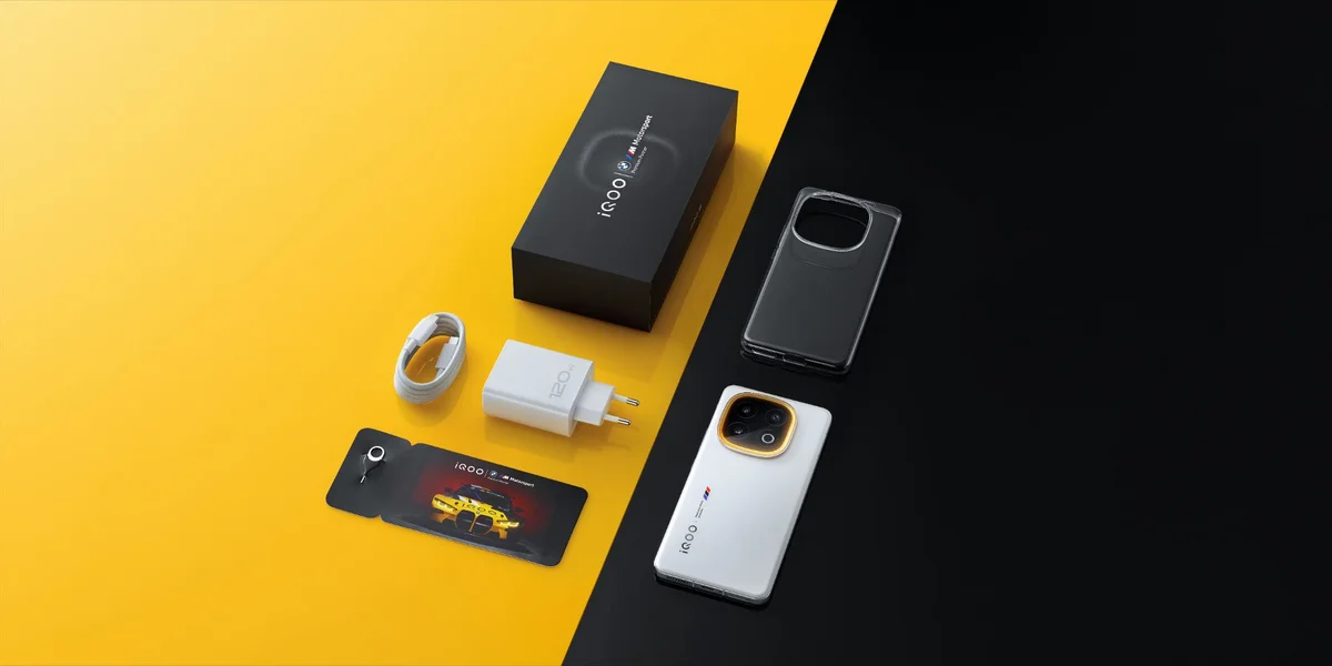
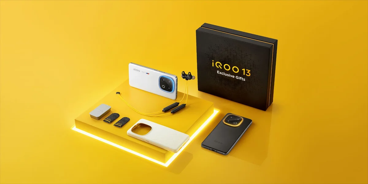
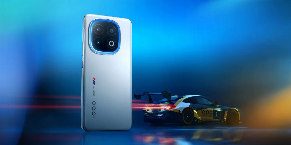
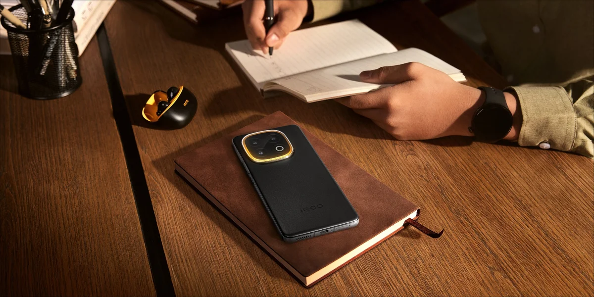
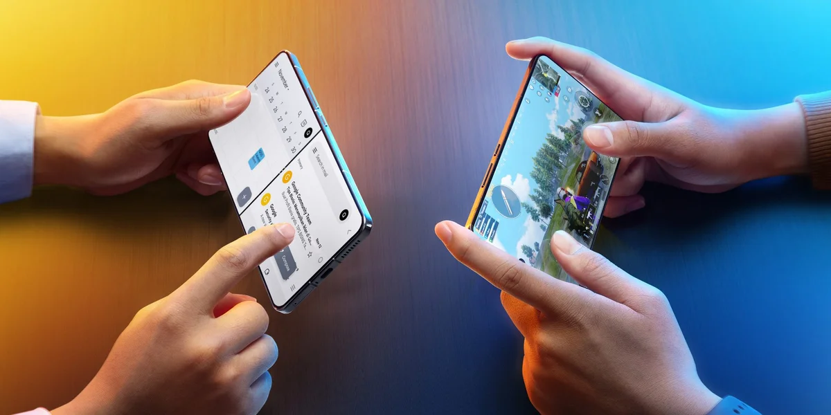
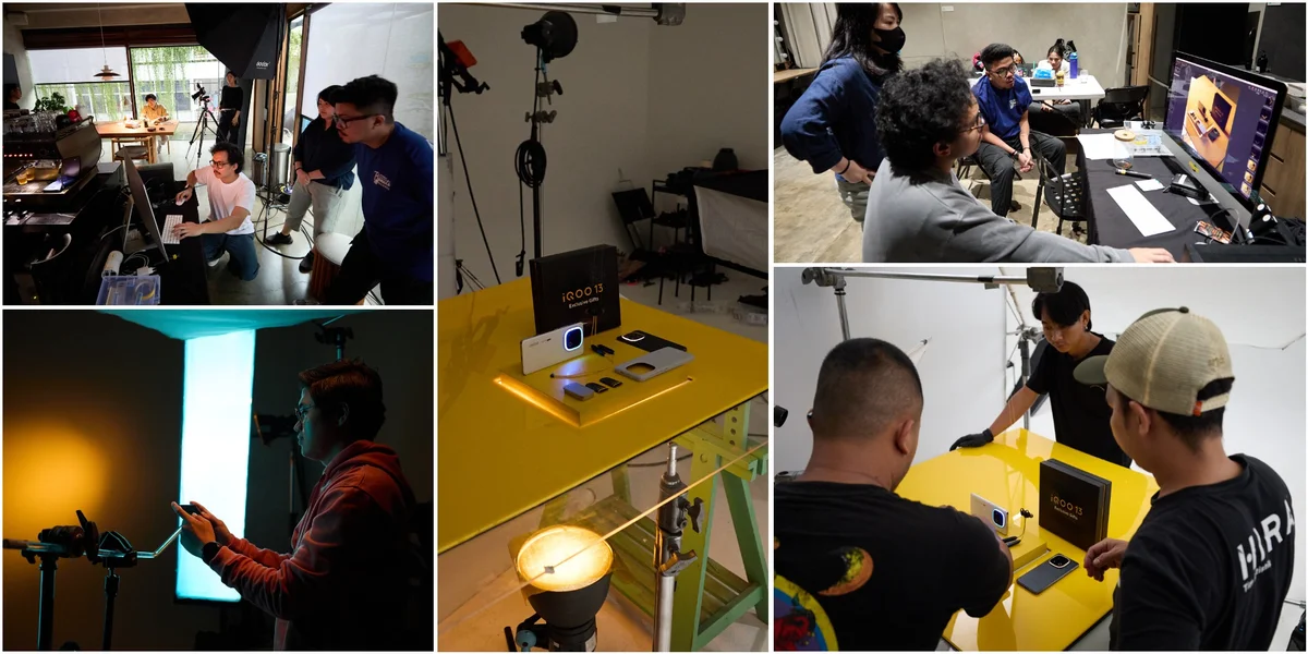
That world started with cars. Specifically, the kind of moody, high-gloss automotive photography where a single beam of light can make a vehicle look like it's been carved out of shadow. IQOO's brand colors, that deep blue against hot gold, gave the whole shoot its spine, and the challenge was translating that palette across wildly different subjects: a hero product shot meant to feel legendary, a macro study of the halo light rear camera, lifestyle scenes of the phone actually being used at a desk or on the move, gift box styling that needed to feel premium without losing warmth, family lifestyle imagery, a cooling chamber visual built almost like a product teaser, unboxing content, and a dual chipset visual meant to communicate raw power.
Each of those needed its own internal logic. The legend shot leaned dark and sculptural, closer to a car reveal than a phone ad. The halo light camera visuals went macro and clinical, letting the ring light do the storytelling. Productivity and family scenes pulled back into real environments, warmer and less staged, because performance means nothing if it doesn't fit into an actual life. The gift box direction went full yellow, saturated and generous, playing more toward retail excitement than tech seriousness. Cooling chamber and dual chipset visuals were where the automotive reference came back hardest: blue undercarriage lighting, gold rim light, the kind of tension between heat and control that a gaming phone needs to sell without saying a word.
What made it work as one campaign instead of eight disconnected shoots was discipline around color and light quality. Every frame, regardless of subject, ran through the same visual filter: brand blue and gold as the backbone, complementary accents used sparingly, lighting treated like it was sculpting metal rather than just illuminating a product. That consistency is what lets a phone photographed in a kitchen and a phone photographed like a supercar sit comfortably in the same campaign.
IQOO 13 wanted to be seen as a leading performance device, not just another release. The job was making sure every single visual, no matter how different its setting or mood, reinforced that one idea.
Prayogo Yoedo
Advertising photographer of HIRA Imaji, Jakarta.