LeMinerale "Galon" Campaign
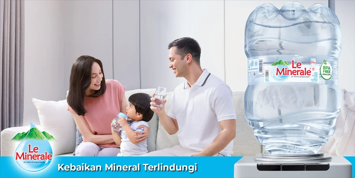
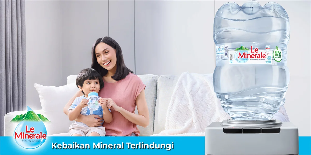
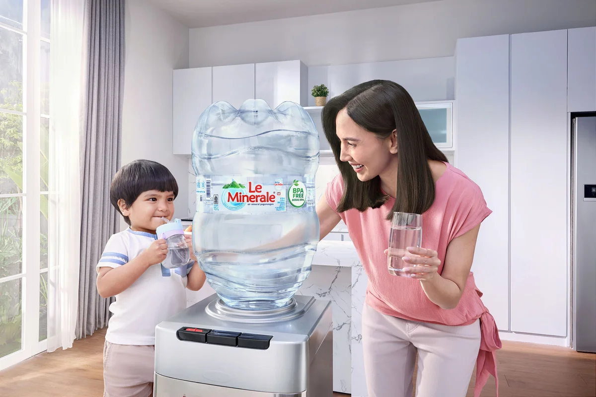
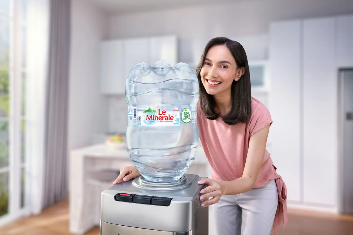
Water is invisible until something goes wrong with it. That's the paradox of shooting a campaign like this. Nobody thinks about their gallon of drinking water until a lid doesn't seal properly, or a seam leaks, or a label somewhere raises a question about what's actually inside. Le Minerale wanted to own that invisible layer of trust, and my job was to make trust look beautiful.
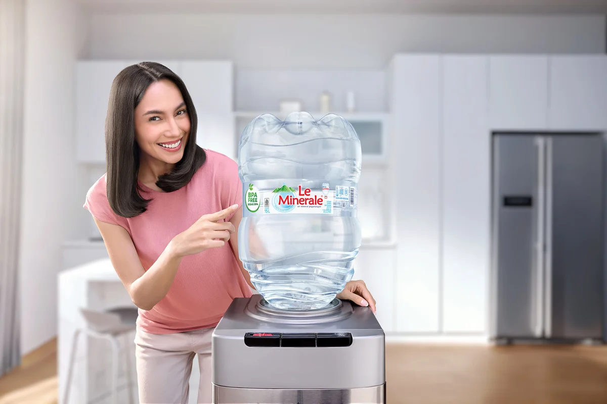
The category itself is crowded and, frankly, a little tired. Competing brands lean on the same visual grammar: a family gathered around a dispenser, a reassuring tagline, a bottle photographed like every other bottle before it. Le Minerale wanted something different. Premium instead of purely functional. Bright and modern instead of generic domestic warmth. The brief was clear that the product itself needed to be the hero, not a prop in someone's kitchen, but the actual subject commanding attention in every frame.
That meant treating the gallon the way you'd treat a luxury object. Precise highlights along the curve of the plastic. Water rendered with enough clarity that you could believe in its purity just by looking at it. A slight cool undertone running through the color grading, giving everything a clean, aspirational edge without drifting into something cold or clinical. Every surface had to communicate quality before a single word of copy did.
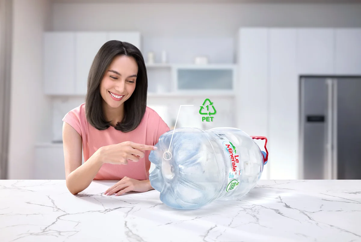
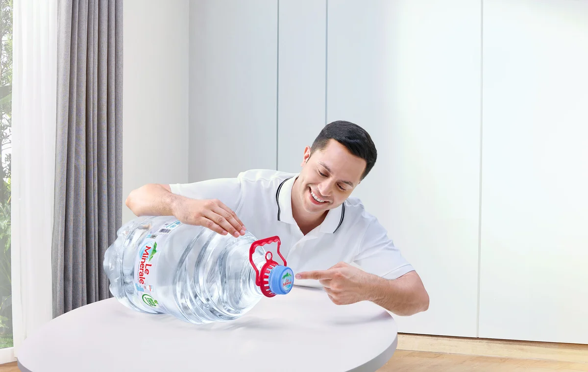
But hygiene claims and BPA-free assurances mean nothing without human stakes attached to them, so we built a series of vignettes around the people who actually worry about these things. A mother checking a gallon's seal with quiet care. A father demonstrating that a cap won't leak, hands confident and unhurried. A daughter drinking straight from a dispenser, unbothered, the way kids are when something simply works. Each visual paired one specific product benefit with one specific relationship, hygiene with a mother's instinct, protection with a father's attentiveness, safety with a child's easy trust. That pairing did more communicative work than any headline could.
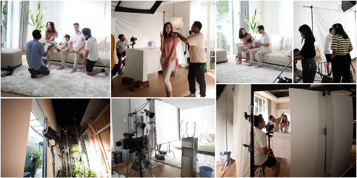
Interaction had to feel unstaged even inside a fully controlled studio environment. Real texture in a family's closeness, real warmth in the way a child leans into a parent. We studied natural domestic moments obsessively, chasing the specific kind of tenderness that doesn't look directed even when every inch of it was. That tension between control and spontaneity runs through most product photography, but it's especially sharp when the emotional core of your story is something as ordinary as a bottle of drinking water.
By the end, what we built wasn't just proof of specifications. It was a version of domestic life where an unglamorous household necessity gets treated with the same visual respect as skincare or fashion. That shift in perception, from utility to aspiration, is the quiet ambition behind campaigns like this. Make people care about something they were never meant to think twice about.
Adhitya Himawan
Co-founder and photographer of HIRA Imaji, Jakarta.