TRI Antispam & Antiscam Campaign

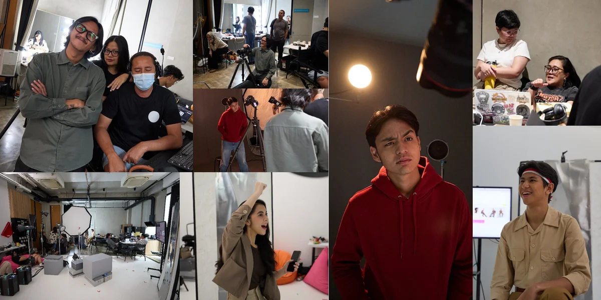
Two campaigns. One studio. The brief was a creative double-header for Tri Indonesia, and from the start I knew the challenge wasn't just execution — it was tone management. These two ideas couldn't be more different in feeling, and I had to hold them in the same room.
The first campaign arrived with a big, unapologetic idea: Merdeka dari penjajah —freedom from colonizers— mapped against Merdeka dari scam dan spam (freedom from digital predators). The brand was drawing a line from 1945 to 2025, arguing that the spirit of liberation is still alive and relevant, just pointed at a different enemy. Loud, patriotic, and proud. I needed talent that could carry that weight — young Indonesians who looked like they meant it.
For the Independence Day key visual, I worked with two models in period-inflected silhouettes: the male talent in sandy khaki, a red and white ikat headband; the female talent mid-leap, fist raised, energy barely contained. Behind them, a crowd of jubilant youth fills a magenta-drenched band across the center of the frame —a composited street scene that carries both the heat of 1945 and the digital brightness of the present. The color split was intentional: violet on the left, warm magenta bleeding into red on the right, with the years 1945 and 2025 anchoring the composition like bookends. The lighting on talent was engineered to feel consistent with both world, flat enough to composite cleanly, yet alive enough to read as human.
Then the second campaign asked for something quieter. More interior. More paranoid.
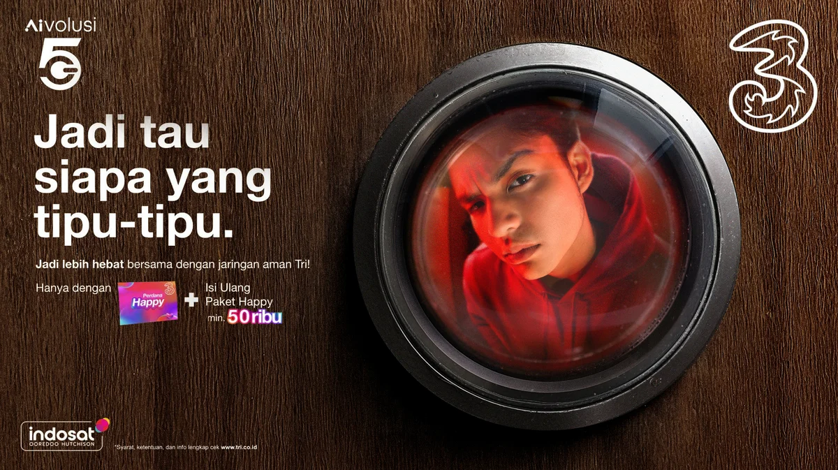
Jadi tau siapa yang tipu-tipu, "Know who's trying to fool you." The creative concept was a door peephole: that moment of suspicion when someone rings and you don't know who's on the other side. The answer, in this case, is a scammer. I shot the talent bathed in a deep red gel. Hooded, sharp-eyed, face distorted through the lens's curvature. The texture of a dark wood door surface frames the entire composition. What comes through is something between a portrait and a warning. Not dramatic, but deeply uncomfortable in exactly the right way.
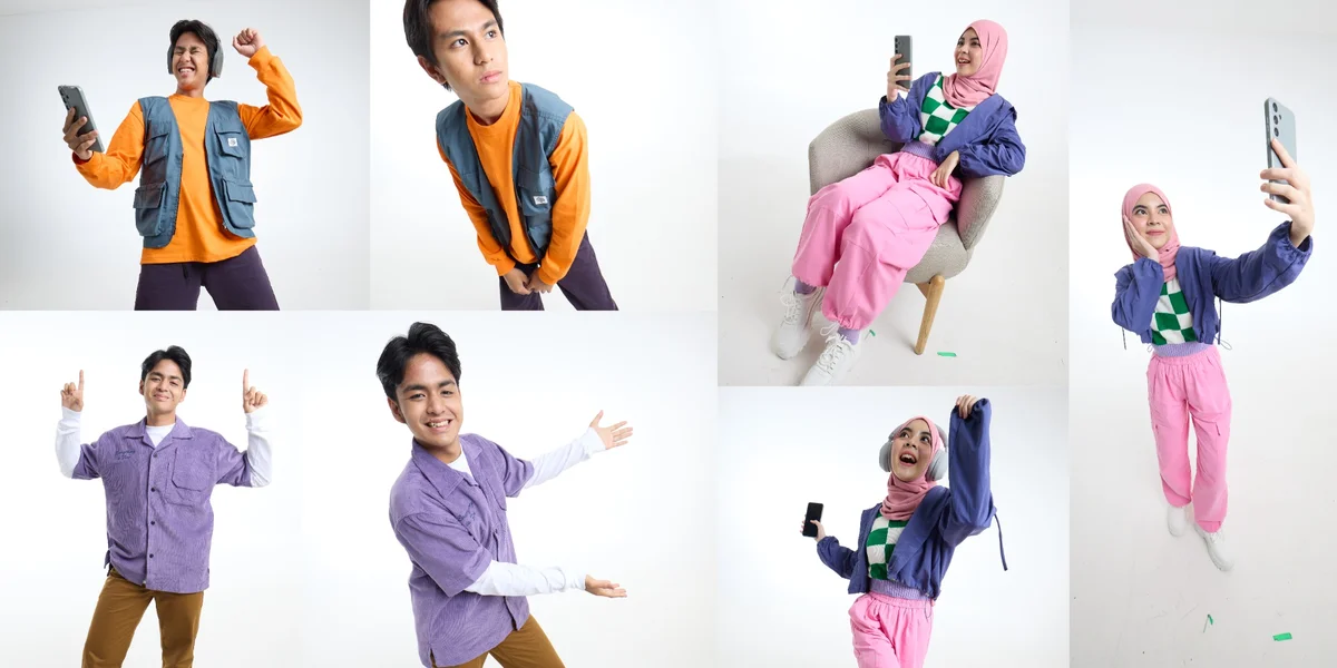
Between the two campaign setups, we also produced a full library of stock assets. Talent against clean, bright backgrounds in a range of poses and color palettes, built for versatility across digital placements. These are the images that tend to go unnoticed publicly but do the quiet work of keeping a brand cohesive across every surface it touches.
The distance between patriotic euphoria and low-lit paranoia is not as wide as it sounds. Both are about awareness. Both are about knowing what's worth fighting for, and what to watch out for. That turned out to be a useful thought to carry through the whole day.
Arza Nursatya
Advertising photographer of HIRA Imaji, Jakarta.